
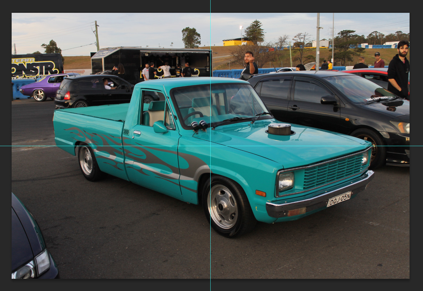
BEFORE (raw unedited).
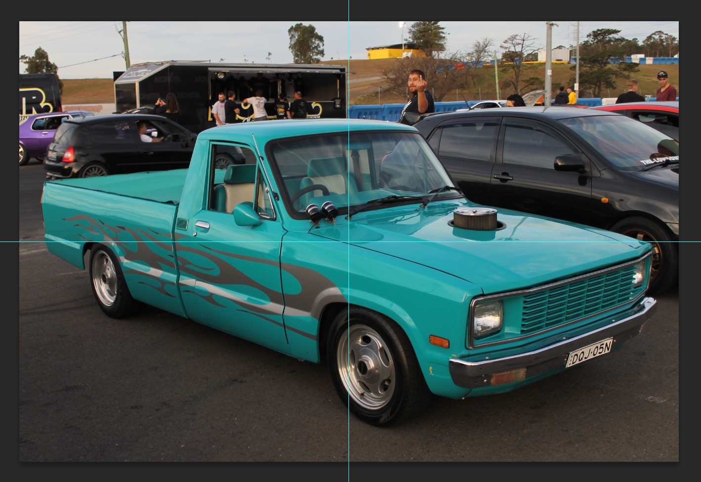
AFTER.
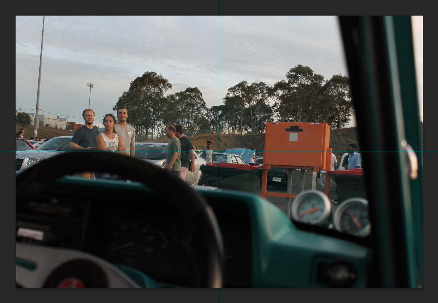
BEFORE.
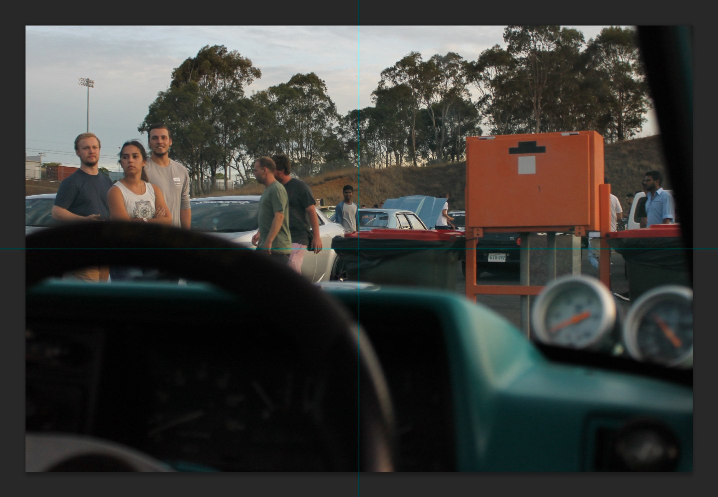
AFTER.
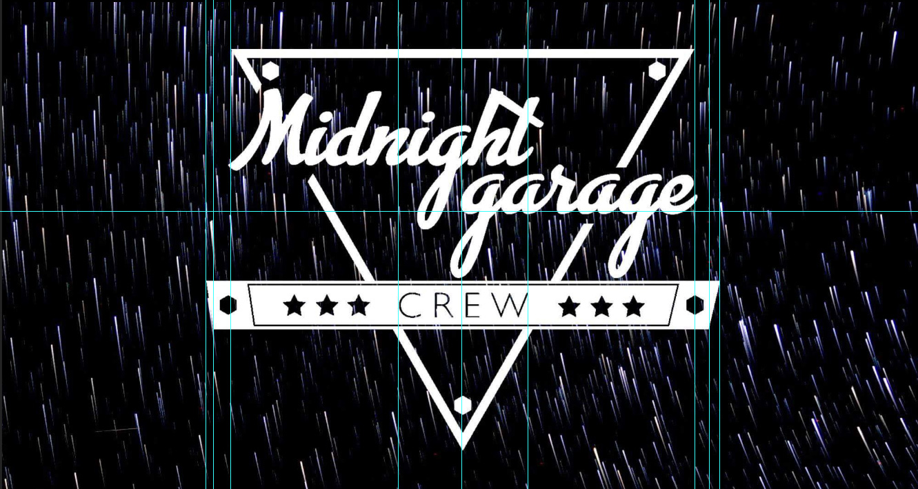
Their logo design is way out of whack as you can see now that I’ve put a grid over it.
I hung out with the young guys from Midnight Garage yesterday. They’re good dudes who have always supported ZEN and EOMM. A little while back they started their own brand “Midnight Garage” and so far the guys have come up with a logo and have started to shoot at automotive events.
We had a good catch up, and ended up talking about all sorts of stuff (I might get these guys on the podcast at some point!), but I thought I’d take the time to show them how I frame in hopes it would rub off on them. Will gave me his memory card of shots from a meet the night before and I picked out both shots above to re-frame.
The top image is pretty straight forward, but just a note that it’s always better to shoot a few steps back at car meets rather than being so close you end up cropping parts of the car you’re shooting (which he had done in a fair few shots).
The second image was one of his worse images on the SD Card but hey my slight rotation and crop shows how you could sometimes even save a bad image with a little dynamic framing.
Now the logo file; I knew it wasn’t tight just looking at it, but I thought I’d explain why to the guys by putting it into photoshop then layering a grid over it. As you can see nothing lines up at all. The CREW is off centre, the left little octagon is too. The crew banner edges have different angles both the left and the right and the 3 lower case g’s look super repetitive and make this hand written style font obviously look like a font (a capital G would have been better for Garage). The way the triangle crops around the letters isn’t working either as it’s almost dynamic on the left side, but cut horizontally straight on the right side.
I made sure the guys realised that I was in no way at all having a go at their designer, he’s a junior/young and I’ve got way more experience, but it was awesome to be able to show the guys exactly why the logo didn’t look right to me. Once they saw all the things I saw they were taken aback (I mean these guys already have printed out stickers and T-Shirts of their logo too and they didn’t see all the faults that I saw).
Whilst I’m damn tempted to refine their existing logo (as it only needs a few tweaks here and there to make it a lot tighter) I’m thinking that I’ve got to stop being so generous in order to avoid those nasty resentment issues of mine!!! The guys are totally onto it in any case. I’m sure they’ll sort the logo out and I’m also sure their shots will be framed nicer going forwards too.