
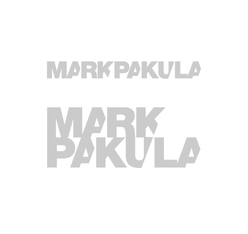
I’ve just finished this logo design for Australian Photographer and friend Mark Pakula.
I love designing logos more than anything else when it comes to design, maybe because they’re more about form, playing with letters, symbols and shapes not to mention they’re super challenging as they have to represent others.
I always start in black and white first as working with colours too early can get kinda messy, especially when the client hates a colour you’re using in the mock-ups. Working in black and white also assures that the logo can be photocopied or faxed.
Mark’s logo came about fairly easy. I had the music up loud and I was having fun with it. We went through a few refinements and in the end we have 2 logos which we’re both happy with (it’s a great place to be when you’ve met a client half way and both parties are happy with the end product).
Be sure to check out Mark’s Blog here. Next up is his site which I also get to work on so stay tuned!